The Client
Bella In Bloom was originally a wedding and event floristry business prior to Covid. But since the settling of the virus the business has been doing more creative floristry and less event work which called for new branding and a new website. Oh and that client is me! Yep I’m also a florist who just can’t let go even though I’m now filling most of my hours with graphic design.
The Problem
The previous logo had been in used for over 10 years and whilst it was very popular and easily recognised, it had definitely dated. The business is moving in another direction and to help distinguish that change, a branding refresh was needed.
The previous website was quite extensive, many of the services were culled with the change of business and it was attracting more enquires than there was time to field. A good problem to have when you have a diary full of empty dates but that’s not the direction the business is going in.
The Solution
A simplified logo using the floral elements from the original logo (keeping a connection to the history of the brand) and paired with a brush stroke font with some minor edits to make it more interesting. The flower and leaves were drawn by Lauren from Sail And Swan who is no longer operating.
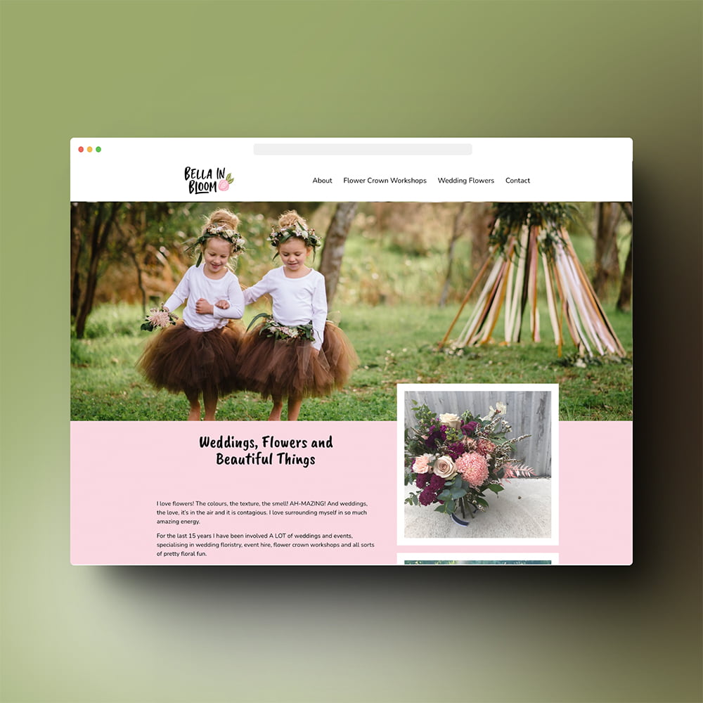
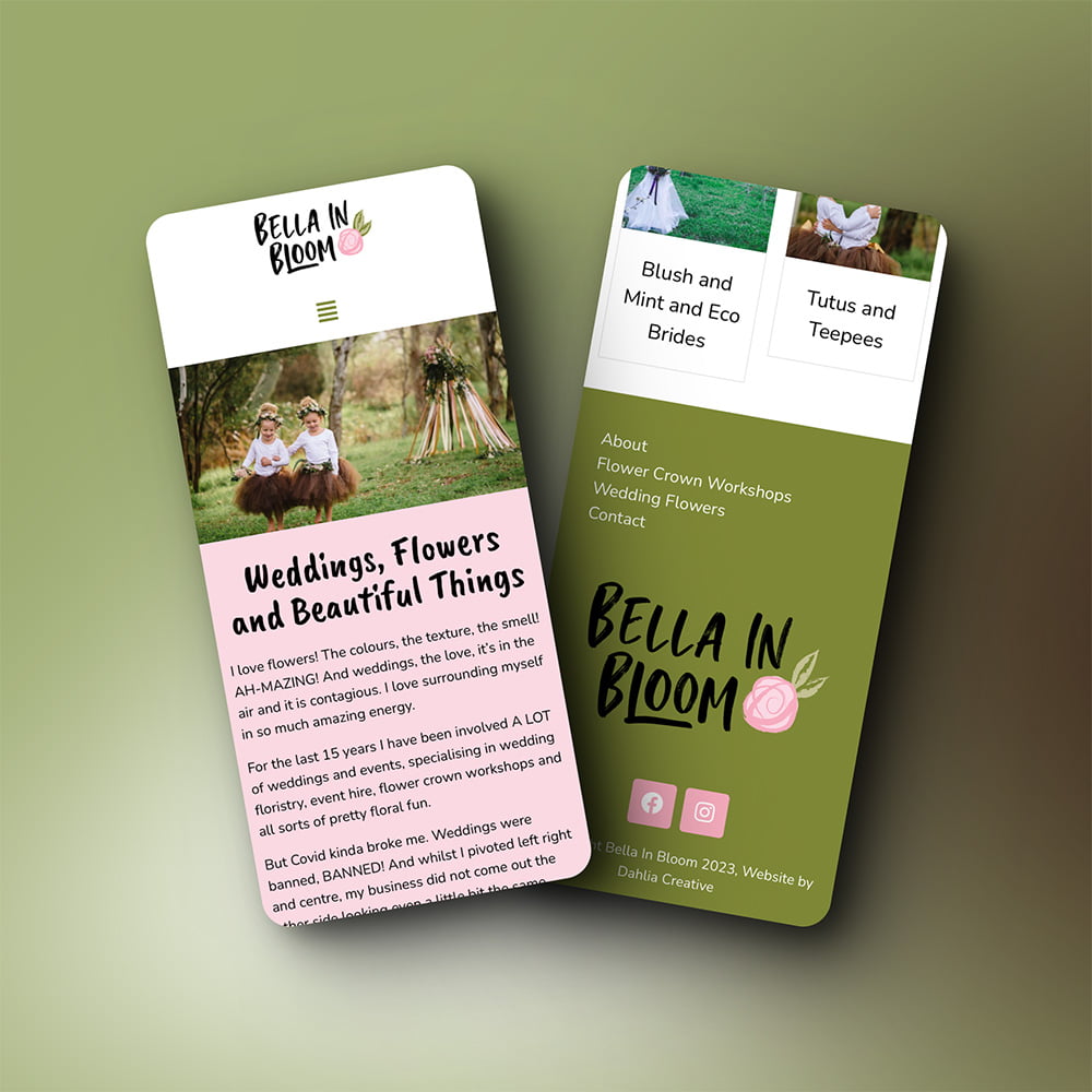
The new website had a lot of its information stripped down to a more basic offering, and moved the focus onto the photoshoots and general information available. This was still a lot of work because the number of pages the previous page has was extensive. It is important to do something about out of date content so it couldn’t be removed from the menu and left to rot.
Focusing on the brand colours and elements and using a few selective photos, the new page was visually refreshing and easy to read.
Website: www.bellainbloom.com.au


